Visualizing data on mobile and creating insights to drive action
Overview
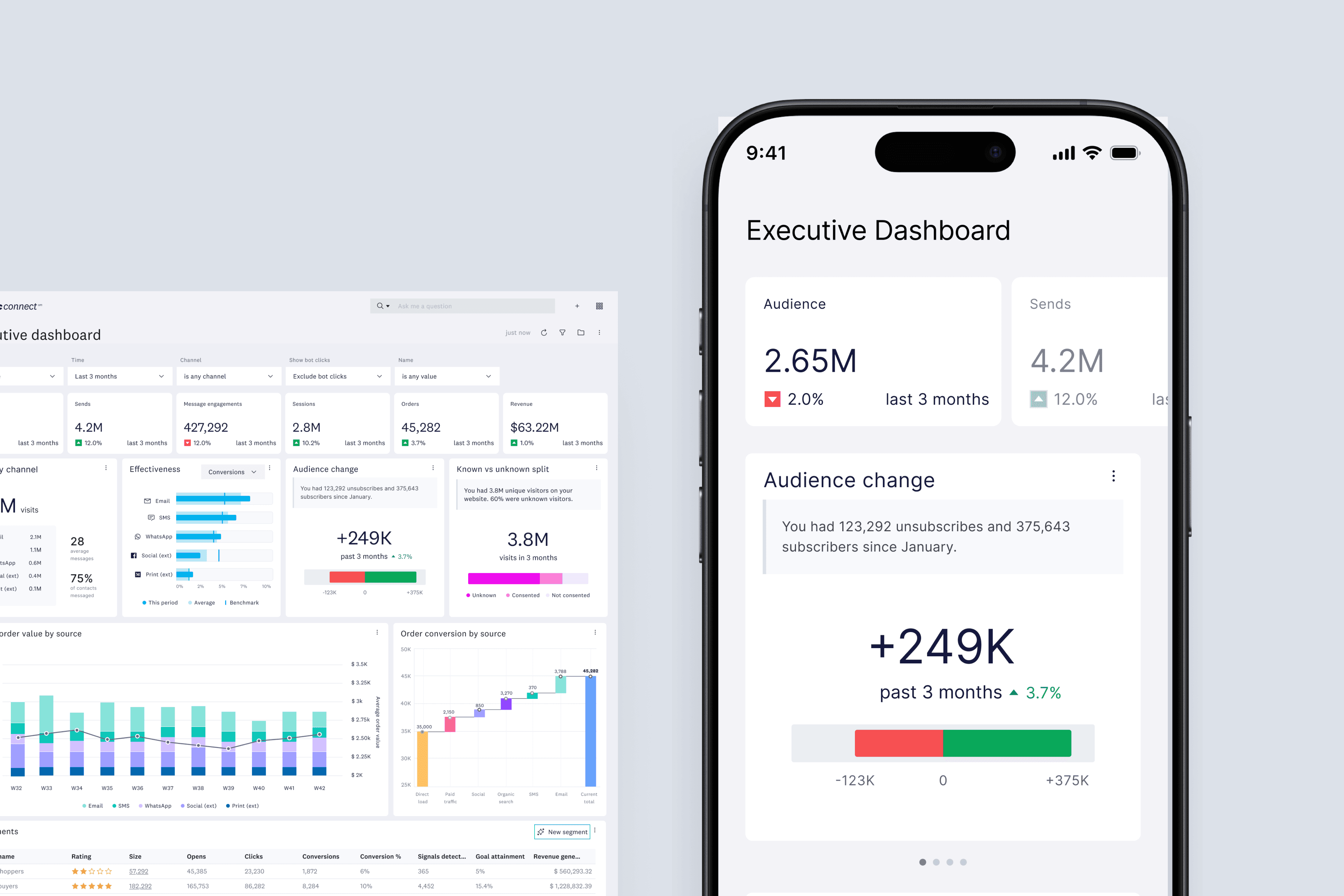
The Executive dashboard is a powerful tool that allows marketers to maintain awareness about a business at a glance.
As a proof of concept, of I led the exploration and design of a mobile-compatible overview.
Impact
My work on this project is to help determine the feasibility and value of adapting our current dashboard for smaller screen sizes. These designs will provide valuable information about the direction of our dashboard designs.
Explorations
Mobile dashboard view
The dashboard screen shows the most important KPI's, widgets, and trends at a glance.

AI recommendation
Clicking into widgets brings up AI recommendations that are easily actionable. The time frame for most widgets are adjustable.
Learning more information
Clicking into widgets gives access to a more detailed chart that users can interact with to gain insights. An example of this is the trendline for the Audience change widget.
Reflections
Building a mobile friendly version of a complex dashboard requires a lot of thinking because space is very limited. As a dashboard, only the most important things should be shown to marketers, and compromising is inevitable. To minimize the sting of lost information and boost the positives of a simple design, its best to speak with users about what they value.